The font in the document you are reading makes a tremendous difference to your perception of it, how easily it is read and the portrayal of the business or individual it is representing.
There are thousands of fonts available today, so knowing which to chose can be a task in itself. Did you know, In the past, when printing was done using letterpress and moveable type, printers used to use all the fonts they had in their advertising to show off the scope of their printing abilities.
Below are some of the more common expressions used to describe a font and their use.
Serif fonts
A serif is a small line or stroke attached to the end of a larger stroke in a letter or symbol within a particular font or family of fonts.
Sans-serif fonts
A sans-serif is a font that does not have extending features called “serifs” at the end of strokes. Sans-serif fonts tend to have less line width variation than serif fonts.
Left justifiedLorem ipsum dolor sit amet, omittam gubergren ne sea, urbanitas adolescens id mel. Ad nulla graeco vix. |
Right justifiedLorem ipsum dolor sit amet, omittam gubergren ne sea, urbanitas adolescens id mel. Ad nulla graeco vix. |
CentredLorem ipsum dolor sit amet, omittam gubergren ne sea, urbanitas adolescens id mel. Ad nulla graeco vix. |
JustifiedLorem ipsum dolor sit amet, omittam gubergren ne sea, urbanitas adolescens id mel. Ad nulla graeco vix. |
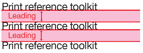
LeadingLeading is the space between lines. |
TrackingTracking is the space between groups of letters. |
KerningKerning is the space between individual letters. |
 |
 |
Should you have any questions about print production, creative, mailing or fulfilment, or have a project you'd like us to look at for you, please get in touch. Find out more about the range of our services available from us here.
1 Osier Way
Swan Business Park
Buckingham
MK18 1TB
01280 824000
info@bcqsolutions.com
Sign up for our latest insights, articles and news.
A Pollard Group Company.